6 Tips and Tricks for Mendix’s Atlas UI Design System

The Mendix Platform is designed to make life easier for business users and developers to build high-quality applications in a short period of time. The latest Platform addition is no exception; Atlas UI is a comprehensive UI/UX toolkit that enables developers to quickly and easily create outstanding designs. Instead of wasting time figuring out how to implement components, Atlas UI lets you focus on creating great designs.
To get started successfully, I’ve put together a list of six tips I think you’ll find useful as you take your first steps with Atlas UI.
1. Put your brand first
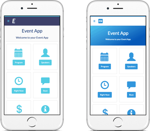
Your brand represents the intellectual and emotional association that people make with your company, product or app. So why not start designing your app by incorporating your brand first? With the Mendix Theme Customizer, you can integrate your brand’s colors, font, and company logo into the design of your app.
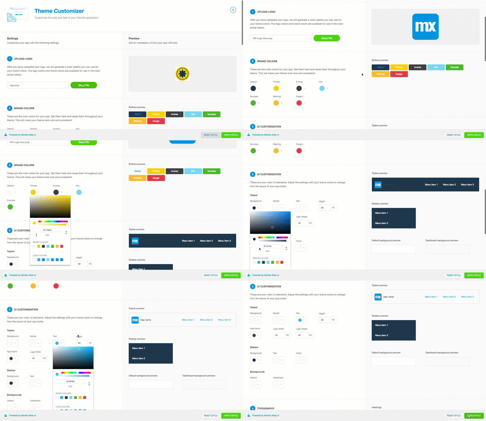
Incorporating the logo with a combination of your brand’s font and distinct color palette conforms building blocks and widgets to your identity, eliminating one-off style changes. As you begin to build your app, you will feel a real sense of ownership because the app reflects your company’s unique brand.
To access the Theme Customizer, click on the Brush icon on the lower left side of the Mendix Web Modeler.
2. Start with a template
I don’t know about you, but a blank canvas can be overwhelming at times when my vision is unclear. Fortunately, Mendix provides a substantial template library built with the Atlas UI framework to kickstart app development. Page templates are a great way to save time, and get the creative juices flowing. Each page template includes a fully designed user interface with building blocks and widgets ready to be wired up.
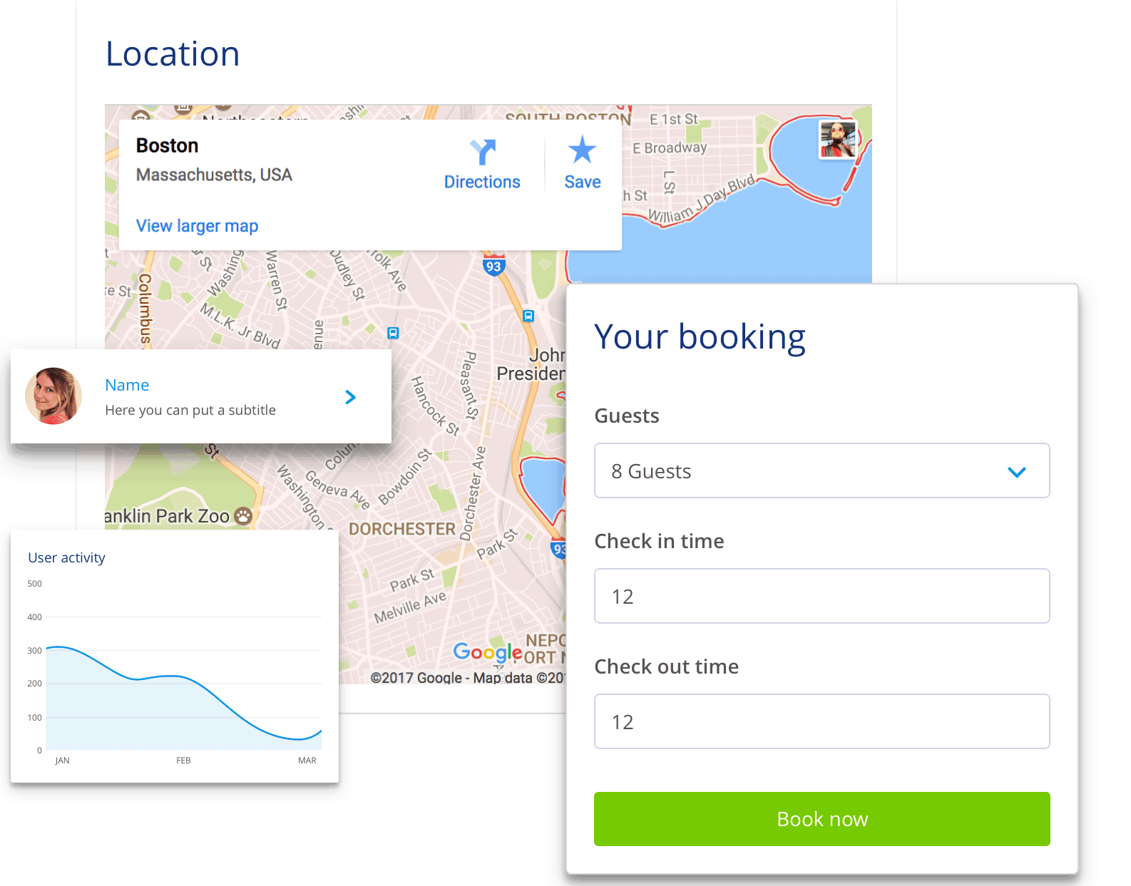
Your users will spend the majority of their time using UIs other than your own (Facebook, Twitter, news websites, etc.). There is no need to reinvent the wheel. Atlas templates (cards, breadcrumbs, hero headers, hamburger menus, etc.) are all designed off established patterns found throughout the web, and are solutions to common user interface problems. Delight and satisfy your users, rather than frustrate and annoy them, with smart design decisions.
3. Get acquainted with Flexbox, your new best friend
Strangely, one of the more difficult things to do when creating web and mobile apps is centering content. Centering content horizontally is relatively easy, but centering vertically is almost always tricky. You only need to google “CSS centering” to find numerous blogs about hacks to accomplish what should be a simple task, highlighting just how difficult it is to achieve.
Fortunately, Mendix has added a number of exciting flexbox building blocks:
- Flex Container Left
- Flex Container Left Center
- Flex Container Right
- Flex Container Right Center
With Flexbox, you can align anything (vertically or horizontally) painlessly with the align-content properties.
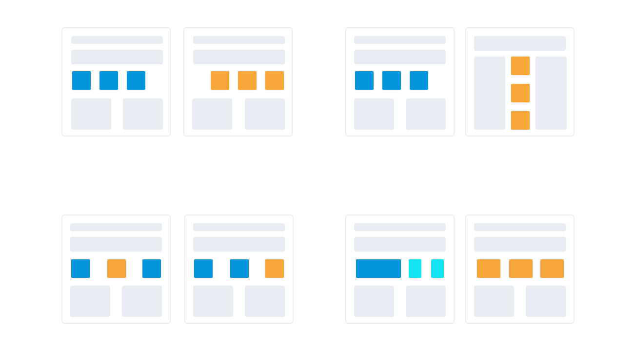
Flexbox has other advantages as well. It’s great for mobile screens and responsive content, as items within your Flexbox container can “flex” their sizes to respond to the available space. It is direction-agnostic as opposed to block/inline layout mode (block is vertical, inline is horizontal), which means you can arrange your content in any direction (to the left, to the right, downwards or upwards). You also are no longer reliant on floats and “clearfix” hacks because Flexbox handles all of that for you.
You can find guides to learning Flexbox here.
4. Preserve and build consistency as much as possible.
Consistency throughout your app boils down to making things continuous, predictable and within expectations. Choosing building blocks, page templates and widgets is significant because of app maintenance, and more importantly, user experience.
The more users’ expectations prove right, the more they will feel in control of the system and the more they will like it.” – Jakob Nielsen
When consistency is present in application design, users transfer knowledge to new contexts effortlessly. For example, using the color green for “save buttons” will associate green with the “save” action. Users know without exerting cognitive effort the UI interaction that will occur when they see green buttons throughout the application. Establishing patterns like the example above eases development and usability of your applications.
5. Use design elements as a creative springboard
Earlier, I mentioned how Atlas UI templates help kickstart application development. However, Atlas UI is much more than pre-packaged page templates, building blocks, and widgets. The provided components are a springboard for implementing your own Enterprise Design Language.
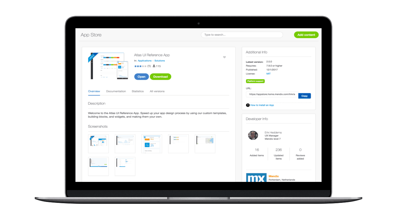
Begin your design language journey by downloading the Atlas UI Reference App from the Mendix App Store. From there, start customizing the pre-configured Atlas UI building blocks, page templates, and widgets, then work on building your own. By investing in an Enterprise Design Language, you will provide a unified set of UX and design rules across your app portfolio and throughout your team, speeding up the transition from design to development.
6. Experiment
The only way you will learn what works and what doesn’t is by experimenting. The WYSIWYG interface of the Web Modeler is an excellent tool for facilitating experimentation, as you can easily create new ideas by changing building blocks and widgets, or by adjusting the design properties of existing design elements. The more you experiment with Atlas UI, the faster you will understand the UX/UI elements that enhance engagement, versus those that cause frustration or abandonment.
Using the Atlas UI app while you work
The newly released Atlas UI mobile app enables you to browse through all the page templates, building blocks and widgets on your mobile phone. Explore Atlas UI solutions wherever you are. You can even use it while modeling so you don’t have to keep navigating back to your browser.
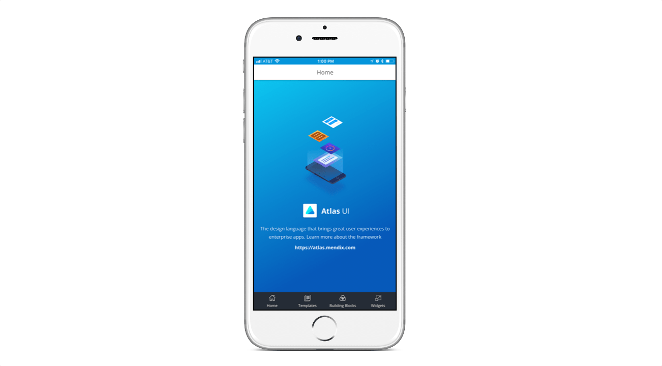
Now go forth and make something amazing in Atlas UI. Download the Mendix mobile app for inspiration.
