3 Mobile UI Tips for Mendix Developers
As my colleague Arjan van IJzendoorn previously mentioned in his blog post, with Mendix you can develop intuitive Multi-Device user interfaces. While he focused on the navigation, this post outlines some quick tips for developing the mobile interface. The focus will be on how to make the user interface and experience as user friendly and professional as possible. While a lot of great rapid app developers know how to display data and create complex and important logic, displaying data in a mobile app is a whole other ball game. The goal for the mobile UI is to make the users think as little as possible and provide a smooth transition and user experience. Sounds easy enough, but in practice it can be a bit of a challenge.
Make Space Count
While the term ‘phablet’ is becoming somewhat mainstream, the biggest screen sizes are still maxing out at 7in diagonal. It might seem like that is a lot of space, but it’s actually not. Therefore, in mobile UI development, every inch of the screen counts and must be used optimally. Keeping that in mind, it’s easy to see why the following tips on space use are important:
- Don’t overcrowd the screen with buttons
- Don’t make the font too small or too big
- Space out rows and columns
- Always ask yourself: is this button/text necessary?
Below is a good and bad example of “using space optimally in mobile UI development. The following app is a sample app designed to create an intuitive way for students to login and see the classes offered by their university. Both views are trying to convey the same information – scheduled classes a student can take – but one of them is bad UI design. Can you guess which one?

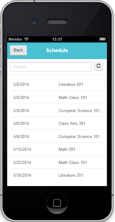
Notice the Don’ts on the bad design:
- The dynamic and static information is unstructured and the same font and style
- There are unnecessary buttons
- Information is all over the place
- The course description is long and not needed
And now the Do’s on the good design:
- There is no need to write Date and Scheduled Course at the top of the list – users know the information already
- Think short and sweet – display as much information as needed, not more
- Less is more! – did I say this before?
- All unnecessary buttons should be removed and voila, the app looks cleaner and as a student you have clear idea of all the scheduled courses and their start dates!
Use mobile Layouts
With Mendix, there are already a lot of mobile layouts that come out of the box with Mendix 5. My short advice here is: don’t reinvent the wheel; take full advantage of them! Now feel free to skip and go on to the next tip.
For those of you who want more details, the layouts are one of the best parts of the Mendix 5 release. In this post, I’ll focus on the mobile phones layouts which provide an easy and intuitive way to organize and align your information. The basic layouts fall into 3 categories: with footer, with menu bar and footer and without footer or menu bar. Below is a screenshot of the basic layouts to highlight what I am referring to.


As you can see above, sometimes it is helpful to have the menu bar at the end of the page for a quick access to other parts of the application or have no footer at all and just show lots of content. By using the phone layouts, the application looks smoother and more professional in each page. Furthermore, the layout automatically directs you towards best practices of UI design such as maximizing the content you can display and has the best “place holders” for content and buttons.
Actions and buttons
Instead of creating buttons to open new pages, you should use on click actions. In the example of the registration app, an on click action would be for the students to click on and see more details on the classes, such as teacher, spaces available, description and how to register. With on click actions you can open pages or microflows and trigger various processes.
Furthermore, Mendix comes with a set of predetermined buttons such as back, cancel, drop down, links and so on. Feel free to play with them and add them wherever and whenever necessary. The button sizes are optimized for an easier UI experience.

Again, be careful and make sure you aren’t going overboard and adding all of the buttons in one page! The scientific term for “don’t confuse the reader with hundreds of touchable items and information” is called “interface entropy”. According to Professor Parham Aarabi from the University of Toronto, you want to keep the information on your screen to under 3.5 bits[1];in other words, the less information the user has to process, the better the user experience will be. Mobile UI design is becoming its own science and there are lots of things you can read up on. I hope my quick tips will be helpful when you are developing your own mobile apps with Mendix!
It’s also worth noting that even though many are done automatically and come out of the box with Mendix, (thinking about how, where and when to display the data and buttons does not come out of the box. No technology can account for OR replace human ingenuity, creativity, logic and innovative thoughts on how to build applications and convey information.
Any other tips on how to develop friendlier mobile user interfaces I might have missed? Feel free to leave a comment below.