Apps often don’t match up with your brand. They use a different style, the logo doesn’t quite match up, and those fonts just look a bit too generic. What you really want is to make your apps part of your corporate app landscape. But in order to do that, the look and feel has to match up. Today, we’re releasing some new features to help you do just that.
The Mendix Theme Creator is quickly becoming an important feature to help developers create great looking apps. Over the last few weeks, we worked on two new features for the Theme Creator: Logo import and the Google Fonts API. The best part is, everything can be previewed in the browser!
Logo Import
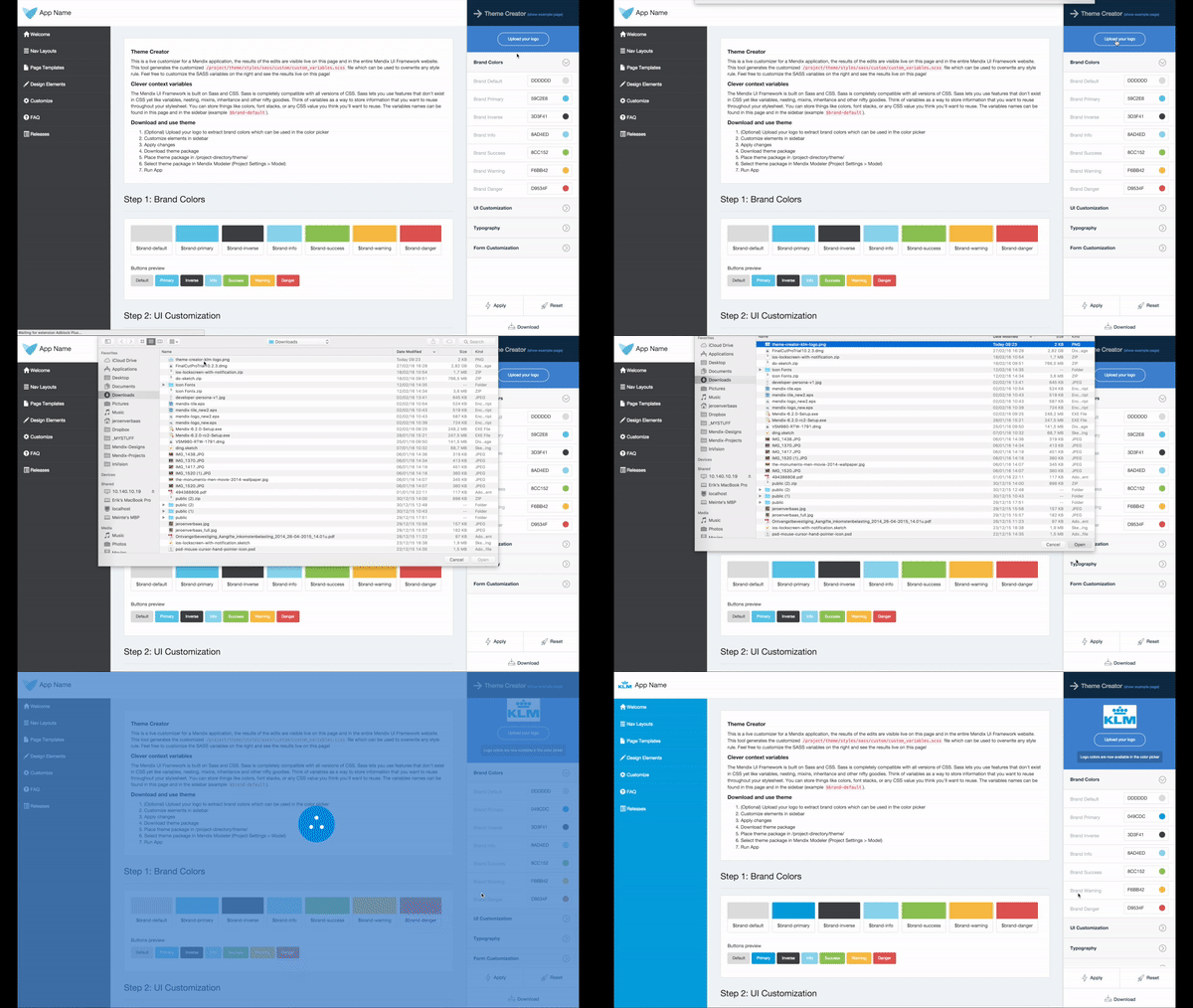
In our last Theme Creator release, we made it possible to import your logo, but only to extract brand colors from the logo and use them in the Theme Creator. In this release we took it one step further: when you upload a logo, it will show directly in the browser, and the logo will be part of the theme package.
The logo is saved to the root folder of the theme package. In our framework, the path to the logo can be found in the _custom-variables.scss file. Here you will find the variable that we created.

If you don’t want to use the logo from your theme package, simply set the $brand-logo variable to false.
Google Fonts API
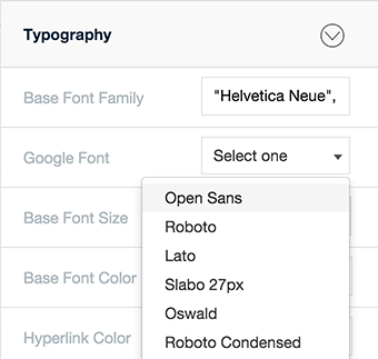
The Google Fonts API helps you add fonts to any web page. With the Google Fonts API, you can preview popular fonts and ones that your brand is already using, directly in the browser. It’s possible to choose from the top 40 Google fonts, including Roboto, Open Sans and Lato. It’s still possible to select a normal font family like Arial or Verdana.

The Google Font that is selected in the Mendix Theme Creator can be found in the main file of our framework, _custom-variables.scss. Here you will find the variable that we created. If you don’t want to use the Google Font anymore, simply set the value of $font-family-import to false.

One last feature we added to the Theme Creator is the possibility to change the sidebar text hover color. This feature was requested numerous times by the community.
Improvements for Mendix UI Framework
We improved the default datagrid styling by adding vertical align middle for rows by default. This improves the inline editing option that you can turn on or off in the Mendix Modeler. We also styled the datagrid footer by default.
We made a few changes to the form-group and input. The form input now uses auto height (this will also be made available for Bootstrap 4) instead of a fixed height. The input uses padding to determine the height so the label will always be properly aligned. You can see this change in the Theme Creator. We added two variables for the form-group: padding for gutters (left and right) and margin-bottom for every form-group. Everything can be found in the _custom-variables.scss file.

We also added a new Navigation Layout. This layout contains a topbar with main navigation and sidebar containing its sub navigation. This navigation layout is available in one of the Theming Starting Points.
Feedback
Be sure to give us feedback at the Mendix Forum and our Github repository!
