As with most development teams, here at Mendix, we apply Scrum to build our applications. Part of the Scrum method is validating the product with users and stakeholders. Yet, this step is often neglected in many development teams despite their best efforts to build a functional product. Usually, what happens is that people overcomplicate usability testing and therefore exclude it from the development process, mistakingly thinking that it is not crucial or that they are saving resources. This is a shame since testing your (minimal valuable) product with users will lead to a better outcome.
Usability testing increases the success of your application
The success of an application depends on how its users use it. Any usability issues can negatively influence the willingness to use your product and, therefore, the application’s long-term success. According to the book: “Rocket Surgery Made Easy” (Kurt, 2010), all applications have usability issues, from minor to severe problems. The trouble here is that usability issues are usually overlooked by the designer, development team, and the product owner because how the application should be used is ‘too obvious’ for them.
With usability testing, usability issues can easily be found and explained. Solving these issues during development is essential to creating a successful application and preventing unnecessary development time and money to fix them afterward.
Why don’t people test?
Even though validating the product with users and stakeholders is an essential element of the Scrum process, usability testing is often left out due to the following reasons:
- Mindset: Let’s deliver the application ASAP, and we’ll adjust it later if needed.
- We (the development team) don’t experience any usability issues, so it should be fine.
- It requires expertise and knowledge, which the development team doesn’t have.
- And hiring an external party to do it costs too much money.
It is often thought that a usability test takes multiple days or even weeks. When faced with a timeline like that, most would rather spend resources on building new features than on testing and fine-tuning the things that are obvious to us.
A usability testing method created for you
Knowing how much of an impact usability testing can make, our design team established a method for testing Mendix products that our makers could insert into their process. After experimenting, we came up with a simple, fast, and cheap way to test Mendix applications. The approach we engineered is inspired by the book “Rocket Surgery Made Easy” (Kurt, 2010) and gives developers, designers, and product owners valuable insights on how the application is used and how it can be improved
During this process, you will always find interesting things that you never thought of, and solving any usability issues will truly make the application more user-friendly. This approach is also an excellent opportunity to increase the stakeholders’ involvement by asking them to participate. Moreover, the outcome could show that the assumptions used in development are, in fact, invalid.
The Mendix usability testing method
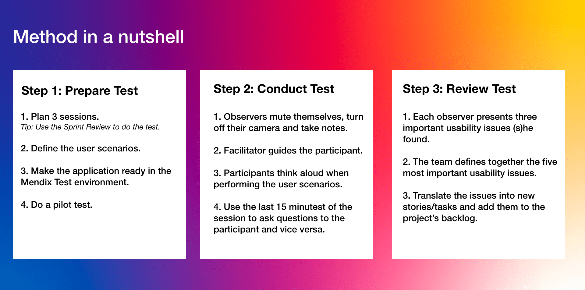
With the idea of keeping things simple, our method consists of three main steps. Listed below is each step, along with some guidelines to help you make the most of every testing experience.
Prepare the test
- Plan 3 sessions – Tip: use the sprint review to conduct the test.
- Define the user scenarios.
- Make the application ready in the Mendix test environment.
- Do a pilot test.
Conduct the test
- Observers should mute themselves, turn off cameras, and take notes.
- Designate a facilitator to guide the participants.
- Ask participants to “think out loud” when performing user scenarios.
- Use the last 15 minutes to ask questions of the participants and vice versa.
Review the test
- Each observer presents three important usability issues they found.
- Together the team defines the top five usability issues.
- Translate each usability issue into new stories/tasks and add them to the project’s backlog.
To best showcase this method, let’s look at the test we created for the Hackathon application* as an example. The goal of this test was to find the usability issues for the organizers when setting up a Hackathon event in the application. One thing to note is that it only took one morning to perform the test.
*Note: The Hackathon application allows organizations to set up and host a complete online hackathon event where hackers can register themselves, upload and watch the solutions, and view the winners. Also, a jury panel can be added, which can evaluate the solutions and assign awards. The Hackathon application is now available in Marketplace.

Setting up the usability test
In total, three sessions of 60 minutes each were planned in the second-to-last sprint of the project. This allowed the team to solve the usability issues in the last sprint before releasing the application. To have the stakeholders involved in validating the application, we asked them to act as participants or observers.
Another part of the preparation was defining the user scenarios for the participants. The team and product owner did this by answering the following questions:
- What things are we not sure about?
- What is the most important feature in the application?
One of the things we were interested in finding out was how the organizers set up a new hackathon event in the application. Were they able to fill in the form without any doubts or hiccups? Did they feel they could add all the necessary information for a new event? Also, leaving a post for the hackers on the newsfeed page was tested with the participants by creating the following user scenario:
“To support the hackers during the hackathon, you want to post a list of tips. Share these tips using the App:
Tips:
-
- Get Up and Move Around to Feel Awake.
- Take a Nap to Take the Edge Off Sleepiness.
- Give Your Eyes a Break to Avoid Fatigue. “
While writing down the scenarios, minimal guidance was added to leave it up to the participants to decide how they wanted to complete everything. Doing it this way would unearth more valuable insights than dictating a strict way to complete it would.
Next, the application was added to the Test Environment of the Mendix platform. To generate a realistic test environment, dummy data of other hackathons events were added, and user accounts were created for the participants to enter the application. Finally, the test setup and environment were verified using a pilot test.
After making the last changes in the setup, we were ready to start the actual usability test!
Conducting the usability test
At the start of each session, the facilitator (this time it was the designer, but it can be anyone on the team) explained the setup and asked the participants for their permission to record the session to allow the team to check things afterward.
Throughout the sessions, observers turned off their cameras and muted themselves to keep the interaction between the participant and facilitator. An even better tactic would be to let them observe from a “different room” to avoid giving the participants the feeling that someone is watching (or even judging) them.
The participants were asked to think aloud when performing the user scenarios (the “Thinking-aloud Method.” This gave the team more insight into what was happening than watching alone would have provided. For example, one participant did not find the “New Hackathon” button. Thanks to him ‘telling’ us where he thought he could find the button, the team gained valuable insight into how to improve the location of the most important button of the application.
While the participants walked through the scenarios, the facilitator was there only to guide them if needed. Trust me; you get the most valuable insights when someone is stuck and must find their own way out. Questions from the participants, facilitator, and observers were noted and handled in the last 15 minutes of the session. This part lends itself perfectly for reflecting on the “pain points” of the participants, especially when asking them more general questions, like: “If there is one thing in the application you could change, what would it be?”
In this example, all three participants answered this question the same way: They would improve the navigation to the ‘Newsfeed’ page. The observers had also noticed that finding the page was indeed a struggle for them.
Review the usability test
Immediately after the sessions, a review meeting was conducted with the observers to discuss the findings. At the start of the meeting, everyone selected and presented the top three most crucial usability issues they found. After this, the team worked together to decide the top five most important usability issues and ranked them from 1 – most important to 5 – less important. Depending on how many essential issues you find, your “top 5” could be “top 7” or “top 10”, etc.
One of the critical issues we found was that the flow for adding the awards and prizes in the application was unclear. None of the participants were able to do it without making a mistake. This was never noticed as a potential issue by the team because the way it should be done was too obvious for everyone involved in creating the app.
At the end of the review, the most critical issues were translated into new stories/tasks and added to the project’s backlog. Due to the benefits of the Mendix platform, the new stories/tasks were quickly processed by the team. All this led to an improved version of the application within less than one sprint (two weeks)!
Conclusion
The significant part about usability testing is that the benefits speak for themselves after conducting multiple, successful tests. Not only will you be producing a more successful product, but the teams involved will also begin treating usability testing as an essential element of the development process they want to be a part of since they get a first-hand look at how their product is used and how it can be improved.
I hope you feel encouraged to start testing your Mendix applications.
Go Make (and Test) it!
